A woman wakes up with a sore throat. She has meetings all day and kids to pick up later, so she grabs her phone and searches for “family doctor near me.” A few clicks in, she lands on your website.
If it opens quickly, looks modern, and lets her book without searching for a phone number, you might see her in your waiting room tomorrow. If it is slow, hard to read on her phone, or makes her call during office hours, she will likely choose someone else.
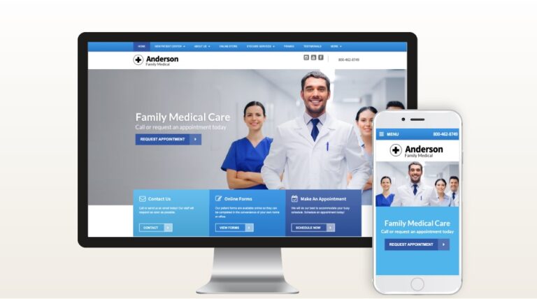
Your website is often a patient’s first impression of your practice. It needs to deliver trust and convenience before they even step inside. For examples of high-quality designs that help medical professionals grow their practices, visit https://www.demandforce.com/medical-websites-for-doctors/.
Make Mobile the Priority
Most people search for doctors on their phones, not on a desktop. A mobile-friendly site means:
- Text that is easy to read without zooming
- Buttons large enough for tapping
- Pages that load in seconds
One local pediatrician updated their site to a mobile-first design and saw a 25 percent boost in bookings within a month. Parents said they loved scheduling appointments from the sidelines at soccer practice.
Booking Should Be Effortless
The harder it is to book, the fewer people will do it. Online booking is now expected. Patients want to pick a time, confirm, and move on, whether it is noon on a Tuesday or 10 p.m. on a Sunday.
Place your “Book Now” button in plain sight on every page. Offer both self-service scheduling and a phone option for those who prefer it. Automated reminders by text or email can also reduce no-shows.
Answer Real Patient Questions
People visiting your site are wondering things like:
- Do you take my insurance?
- How soon can I get in?
- Where are you located?
A clear FAQ page, easy-to-read service descriptions, and downloadable forms can answer these quickly. Even short “What to Expect” videos help patients feel more comfortable making an appointment.
Build Trust with Social Proof
In healthcare, trust matters. Positive reviews and patient stories can be more convincing than any marketing message.
Feature reviews on your homepage, share short quotes, or post brief videos with permission. A dermatology clinic I know increased appointment requests by over 30 percent simply by adding a testimonial video.
Keep it Fast and Secure
A slow website is like a backed-up waiting room. Patients leave.
Compress images, use reliable hosting, and make sure your site displays the secure padlock icon in browsers. Security is essential if you collect any patient information.
Simple Navigation Wins
If someone cannot find your booking button or phone number in 10 seconds, they are gone.
Keep menus simple: Home, About, Services, Book, and Contact. Use a sticky header so the booking option stays visible while scrolling. Avoid clutter and guide visitors toward one main action, which should be making an appointment.
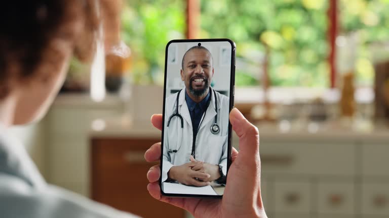
Offer Telehealth Options
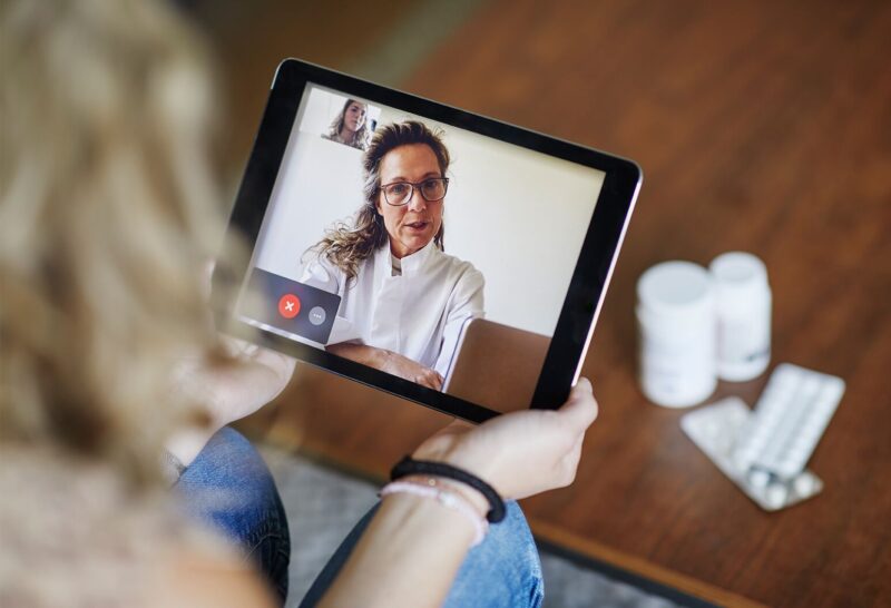
Even if most visits are in person, telehealth can expand your reach. It is ideal for busy professionals, parents with sick kids, and patients who live far away.
A small clinic in my area added a virtual visit option and now 10 percent of their bookings come from telehealth appointments, many from outside their immediate area.
Keep Content Fresh
A website that has not been updated in years looks neglected. Post seasonal health tips, introduce new staff, or announce services. Fresh content shows you are active and engaged, and search engines reward it.
Small updates like swapping photos or adding a quick blog post can make a big difference in how patients perceive your practice. For inspiration on structuring a modern healthcare website with engaging, up-to-date content.
Think Like a Patient
Visit your own site as if you were new to it. Does it load quickly? Can you find the booking button without scrolling? Is the information clear?
Even better, ask someone unfamiliar with your practice to try it and note where they get stuck. Those roadblocks are costing you bookings.
The Takeaway
Your website is more than an online brochure. It is the digital front door to your practice.
When it is mobile-friendly, easy to navigate, fast, and focused on patient needs, it works in the background to fill your schedule day and night.
A few small changes can turn casual visitors into booked patients. The question is, when will you start?